The letter looked fine in the hoop. Then it went through one wash. It came out lying flat on the linen like a sticker, its edges ragged and the stitches sliding apart at every curve. That is what happens when satin stitch goes straight onto bare fabric with nothing underneath it.
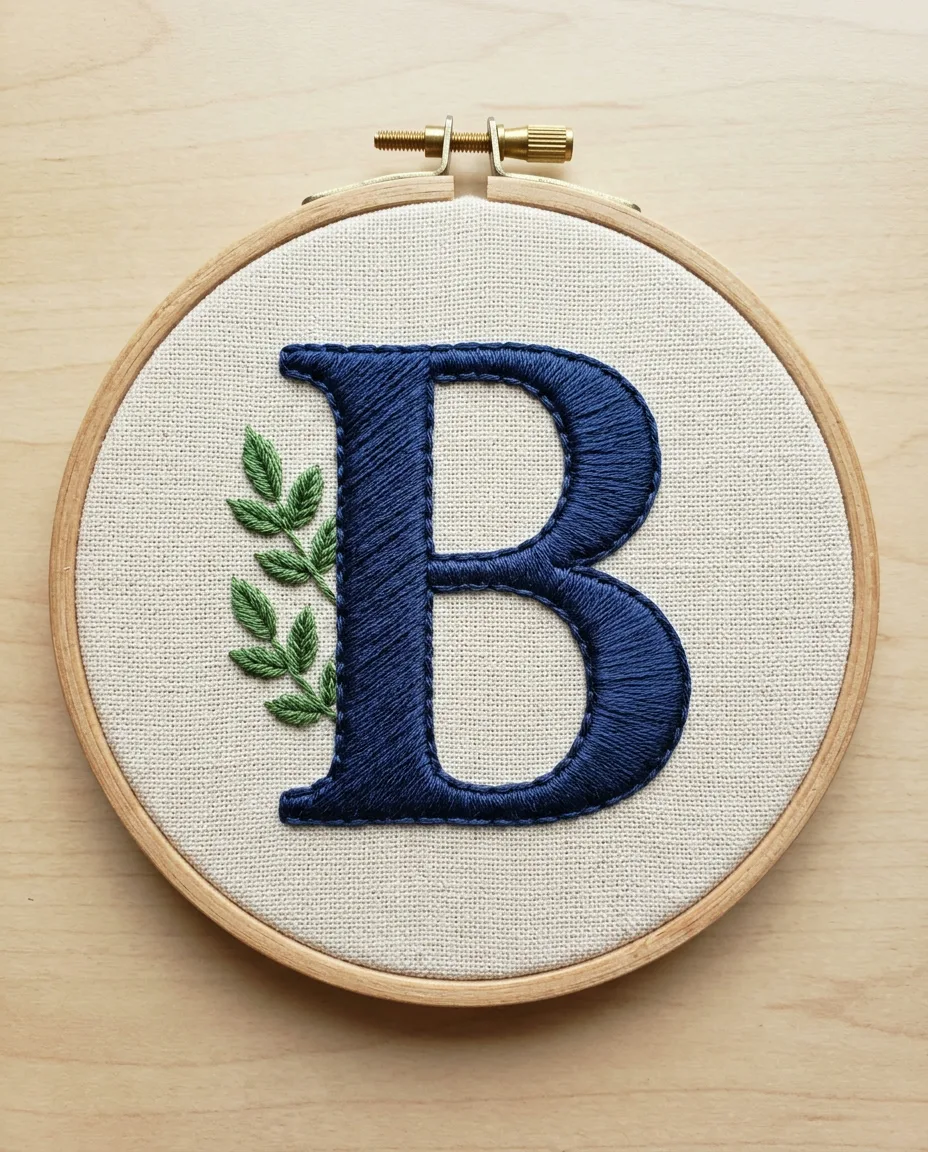
A traditional monogram is built in layers. First comes an outline that holds the edge. Then padding, which is rows of hidden stitches that lift the letter off the cloth. Satin stitch goes on last, laid over the top like a smooth blanket. The padding is the part most tutorials skip, and it is the reason old household linens still have crisp, rounded letters after decades of washing.
Plan on 3 to 5 hours for a letter about 2 inches (5 cm) tall. It is slow work and it is not a beginner project. But none of the steps is hard on its own, and the method below works for any single initial.
How to stitch a padded satin monogram
Six-strand floss comes as six thin threads twisted together. You pull out single threads and put back only the number you need. Here you use 2 strands for the outline and the final satin, and 3 strands for the padding, because thicker padding builds height faster.
 Save
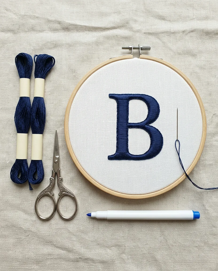
Save- Tape the letter to a sunny window, lay the linen over it and trace every edge with the water-soluble pen. Hoop the linen so it sounds like a drum when you tap it. Loose fabric puckers under dense satin.
- Outline every stroke of the letter in split stitch with 2 strands. Come up on the line, go down 2 mm (about 1/16 inch) ahead, then come up again through the middle of that stitch, splitting its two strands apart. Keep the stitches tiny on curves.
- Start the first padding layer with 3 strands. Work short straight stitches across the thick parts of each stroke, from one side to the other, staying about 1.5 mm inside the outline. Space them 1 mm apart.
- Keep the padding thread on the front. After going down on one side, come back up right next to that same spot. The back stays almost bare, which keeps the finished piece from getting lumpy.
- Lay the second padding layer over the first, again with 3 strands. This time run the straight stitches along the length of the stroke, reaching to just inside the split stitch. Break long strokes into stitches no longer than 8 mm, staggered like bricks in a wall.
- On the thin hairline strokes, skip the straight stitches. A second row of split stitch laid down the middle is all the padding a 2 mm wide stroke can hold.
- Draw a faint diagonal line across each stroke with the pen, at about 45 degrees. Every satin stitch in the letter will follow that angle.
- Thread 2 strands for the satin. Start in the middle of the widest stroke. Come up just outside the split-stitch outline and go down just outside the opposite side, so the outline is buried under the satin.
- Lay each new satin stitch snug against the last one, with no fabric showing between them. Work from the middle out to one end of the stroke. Then return to the middle and work out to the other end.
- Where two strokes cross, finish the stroke that sits underneath first. Satin the top stroke over it, with its edge stitches going down right at the crossing line.
- End each thread by running it under 5 or 6 satin stitches on the back and trimming close. Knots under a raised letter show through as a bump.
- Rinse the finished piece in cool water to lift the pen lines, then roll it in a towel and let it dry flat.
The letter itself: thick strokes and thin hairlines
Serif capitals suit this method best. A serif letter has thick main strokes and thin connecting strokes. Most also have small flared feet. The thick parts take the most padding and rise the highest. That contrast in height is what makes a monogram look hand-worked from across a room.
Skip plain block fonts. Every stroke in them is the same width, so the padding rises evenly and the letter reads flat anyway. Script initials with long looping tails are lovely, but save them for a second attempt. Tapering loops need the satin angle to rotate smoothly around each curve, and that is hard to judge the first time.
2 inches tall is a comfortable first size. Below about 1 inch, the thin strokes get too narrow to pad at all. Above 3 inches, the thick strokes get wider than 12 mm, and satin stitches that long snag in the wash. For a bigger letter, split the wide strokes down the middle with a row of split stitch and satin each half at the same slant.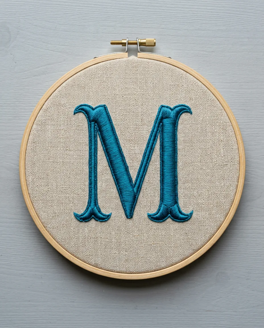 Save
Save
Padding layers get bigger as they go up
Each padding layer should be slightly wider than the one below it. The first layer sits 1.5 mm inside the outline, and the second reaches almost to the edge. Built that way, the stroke slopes up from the sides to a rounded crown in the middle. Reverse the order and you get a flat top with a steep cliff at each edge.
Direction matters too. Each layer runs across the one before it, and the top padding layer runs along the stroke. So the satin, which crosses the stroke at a slant, never sinks into the gaps between padding stitches. Two layers suit most household linen. Three layers look grand on a thick towel and lumpy on a fine handkerchief.
Nothing about the padding needs to look neat. It will all be covered. It only needs to be even in height. Run a fingertip along each stroke before you start the satin. Fill any dip with one or two extra stitches. Check the serifs too, the little flared feet, because they are easy to under-pad. A foot with no padding sits lower than the stroke it hangs from. That step down shows clearly once the satin catches the light.
Satin slant: one angle for the whole letter
Floss catches light along its length. If every satin stitch in the letter runs at the same angle, the whole initial shines evenly, like one piece of polished ribbon. Change the angle from stroke to stroke and the letter breaks into patches of light and dark.
About 45 degrees, leaning from lower left to upper right, is the usual choice for a right-slanting serif letter. On a curve, such as the bowl of a B or the round of an O, the stitches fan slightly to keep crossing the stroke. Let them spread a little on the outside of the curve. On the inside of the curve, tuck in a short stitch now and then that stops halfway across. That keeps the angle steady without piling thread on the inner edge.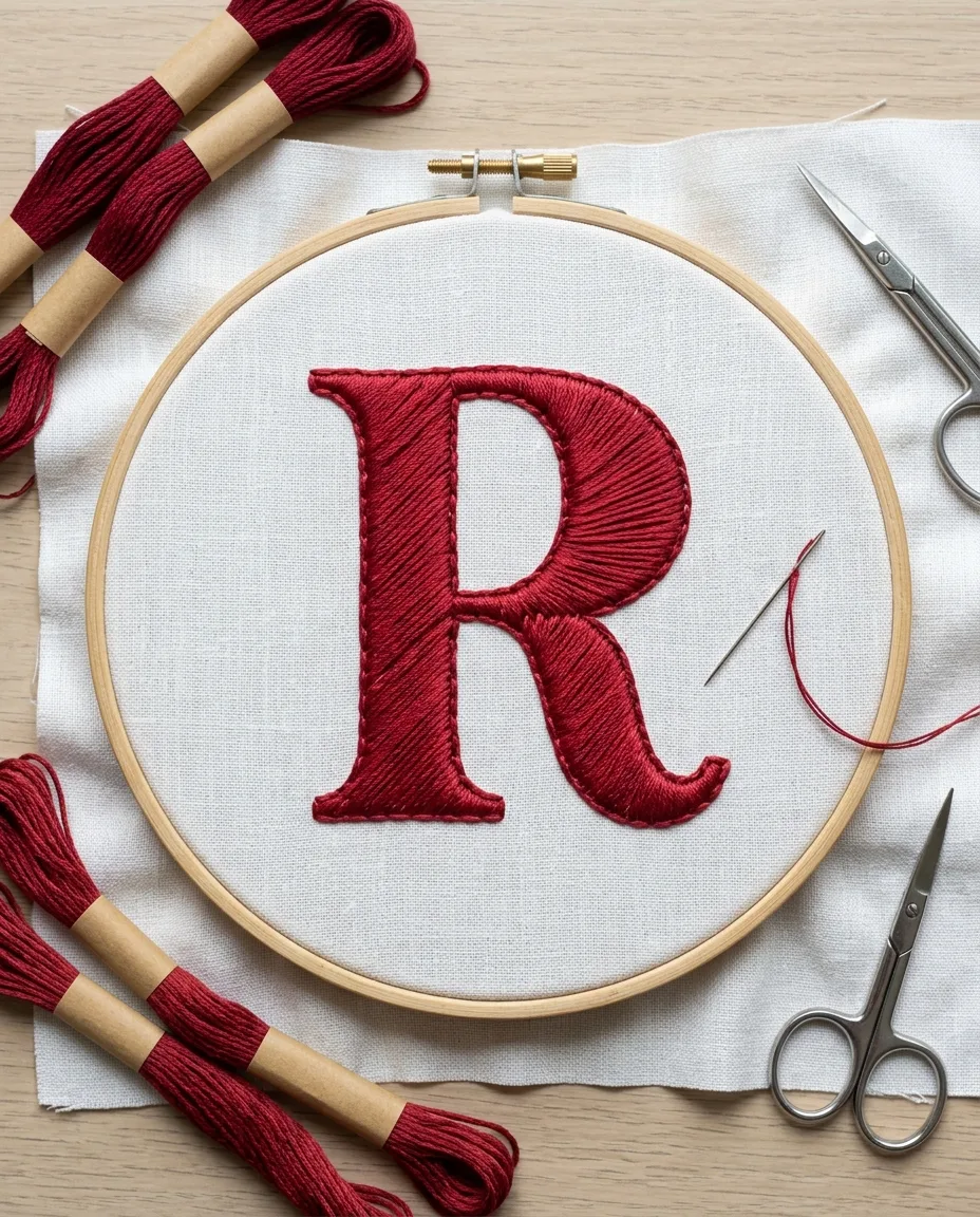 Save
Save
And keep the satin tension even. Pull each stitch until it lies flat on the padding, then stop.
Satin pulled harder sinks between the padding stitches and shows ridges. Loose satin looks fluffy and snags on a fingernail.
When the letter still looks flat
Gaps along the edge are the most common problem. They come from satin stitches that go down on top of the split-stitch outline. Each stitch has to go down just outside it, into bare linen, so the outline sits inside the satin and pushes its edge up.
Wobbly edges usually trace back to the outline. Split stitches longer than 2 mm turn curves into a row of short straight segments, and the satin copies every corner. Unpick the outline on that curve and redo it at 1.5 mm.
Loose fabric does the most damage. If the linen has gone loose in the hoop by the time you reach the satin, the thread pulls the weave together and the ground ripples around the letter. Tighten the hoop screw before every stitching session. Remove the hoop between sessions too, so it doesn’t leave a crushed ring in the linen.
Washing and pressing the finished piece
Never iron a padded monogram face up. The iron squashes the padding, and the letter loses the height you spent hours building. Lay a folded bath towel on the ironing board, put the embroidery face down on it, and press the back with a warm iron. The letter sinks into the towel and keeps its shape.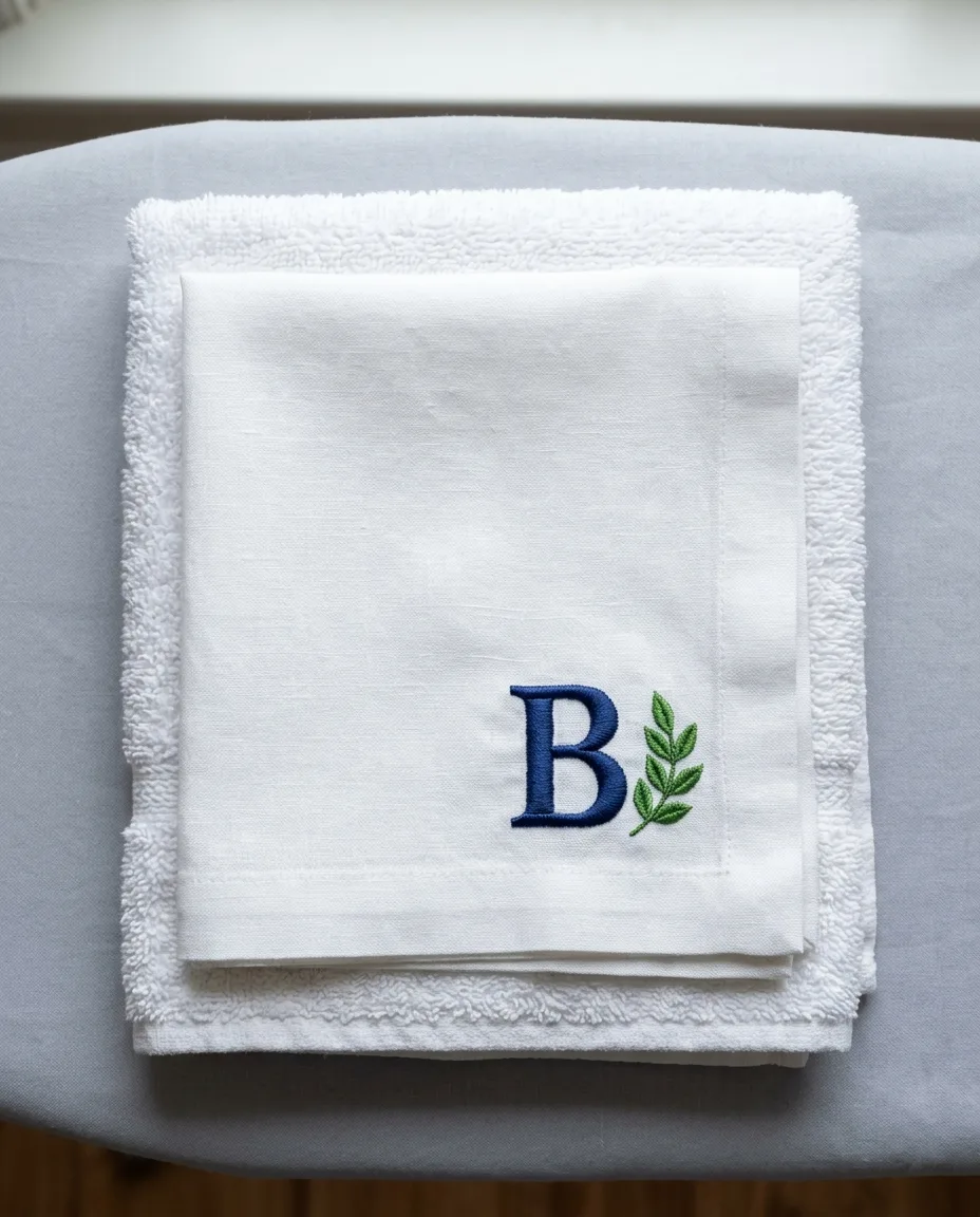 Save
Save
White thread on white linen is the classic look for bed sheets and table napkins. It survives hot washes and bleach. Colored floss is fine too, but wash the first time in cool water with a white rag in the machine to see whether the dye runs. Dark reds and navy blues are the usual culprits.
For towels and pillowcases, wash the item inside out in a mesh laundry bag. Satin stitches longer than 10 mm can catch on zippers or hooks in the drum, and a single snagged stitch pulls the whole row loose.